POTLUCK
Client
Branding, Packaging, Character, Motion
Services
2025
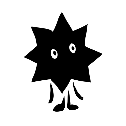
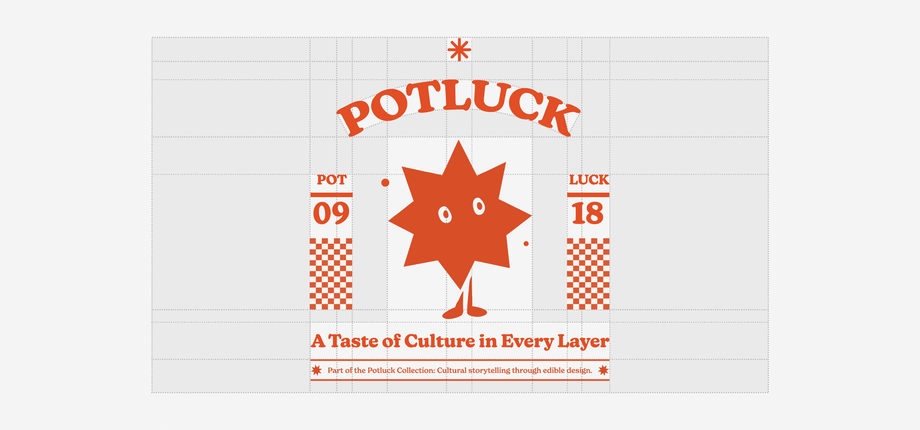
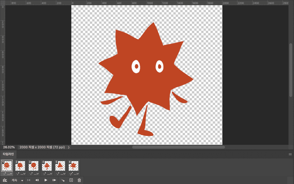
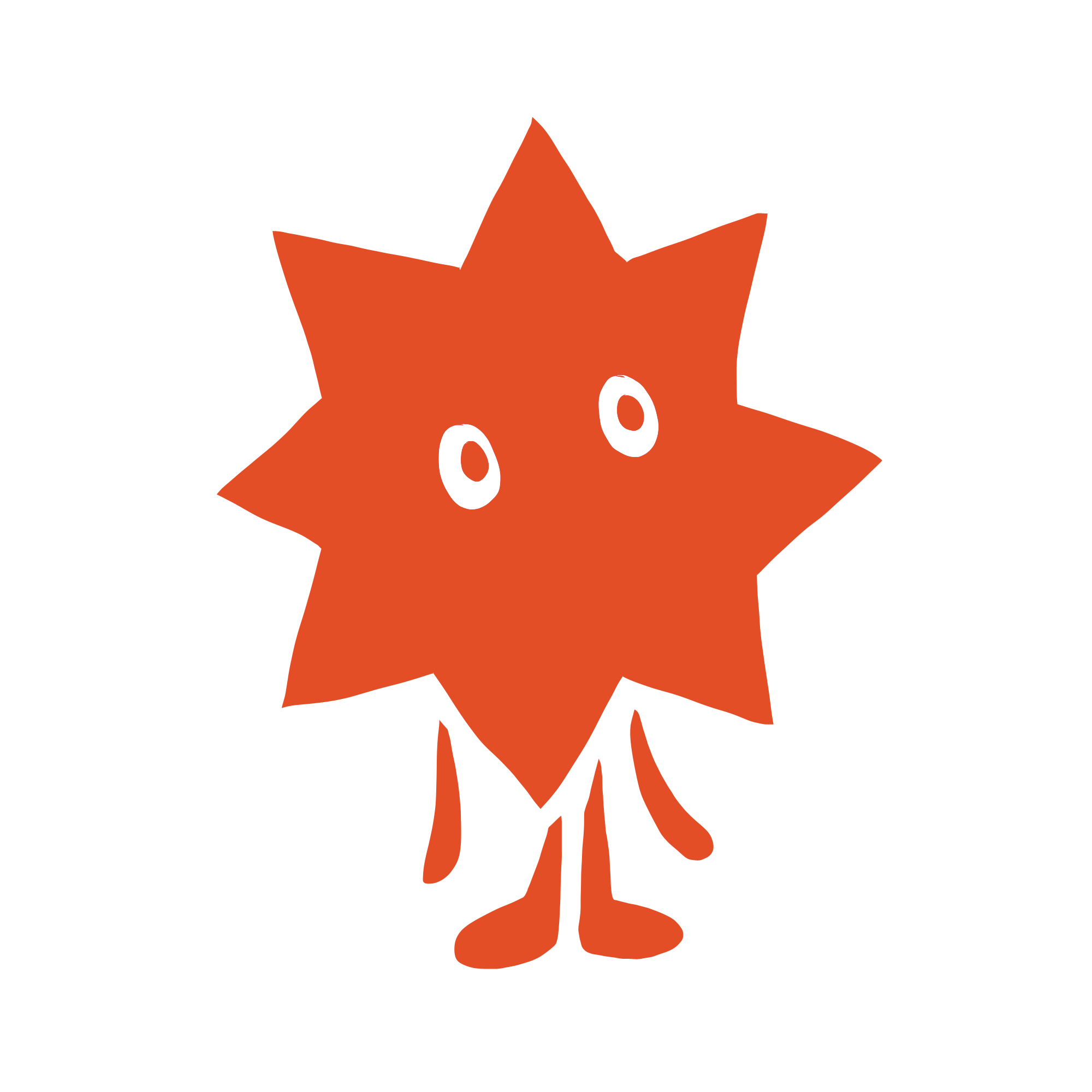
POTLUCK is a conceptual burger brand inspired by the cultural spirit of communal eating—where diversity, modularity, and spontaneity come together in a single, joyful meal. The goal was to develop a brand identity system and packaging experience that would visually communicate the idea of “a taste of culture in every layer.” I designed a character-led brand system that translates the communal ritual of eating into visual identity, packaging, and motion. From character design to burger box, my role spanned visual identity development, packaging system design, and animated assets—all built around the central metaphor of food as culture, and culture as something shared, served, and savored.
 |  |  |
|---|
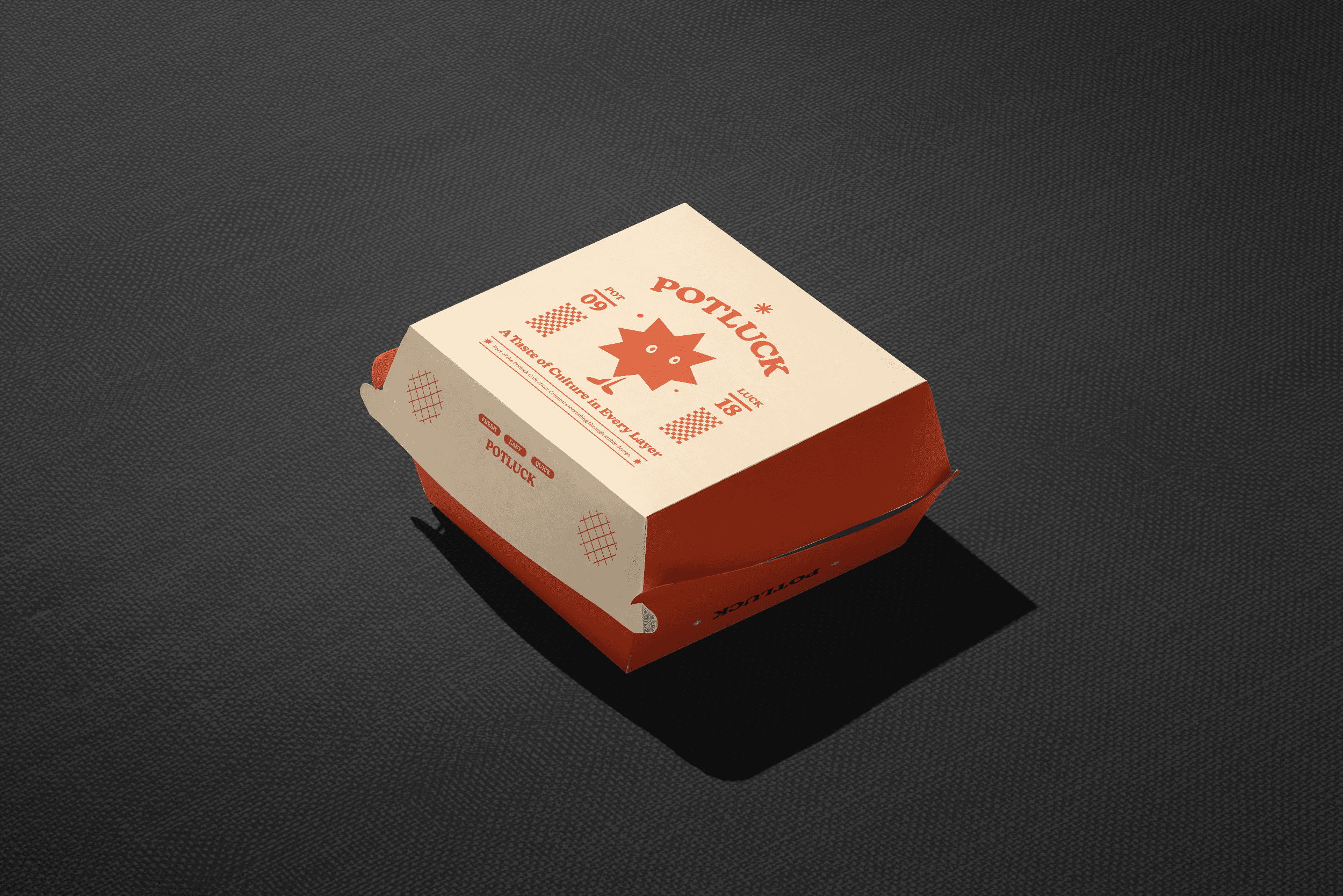
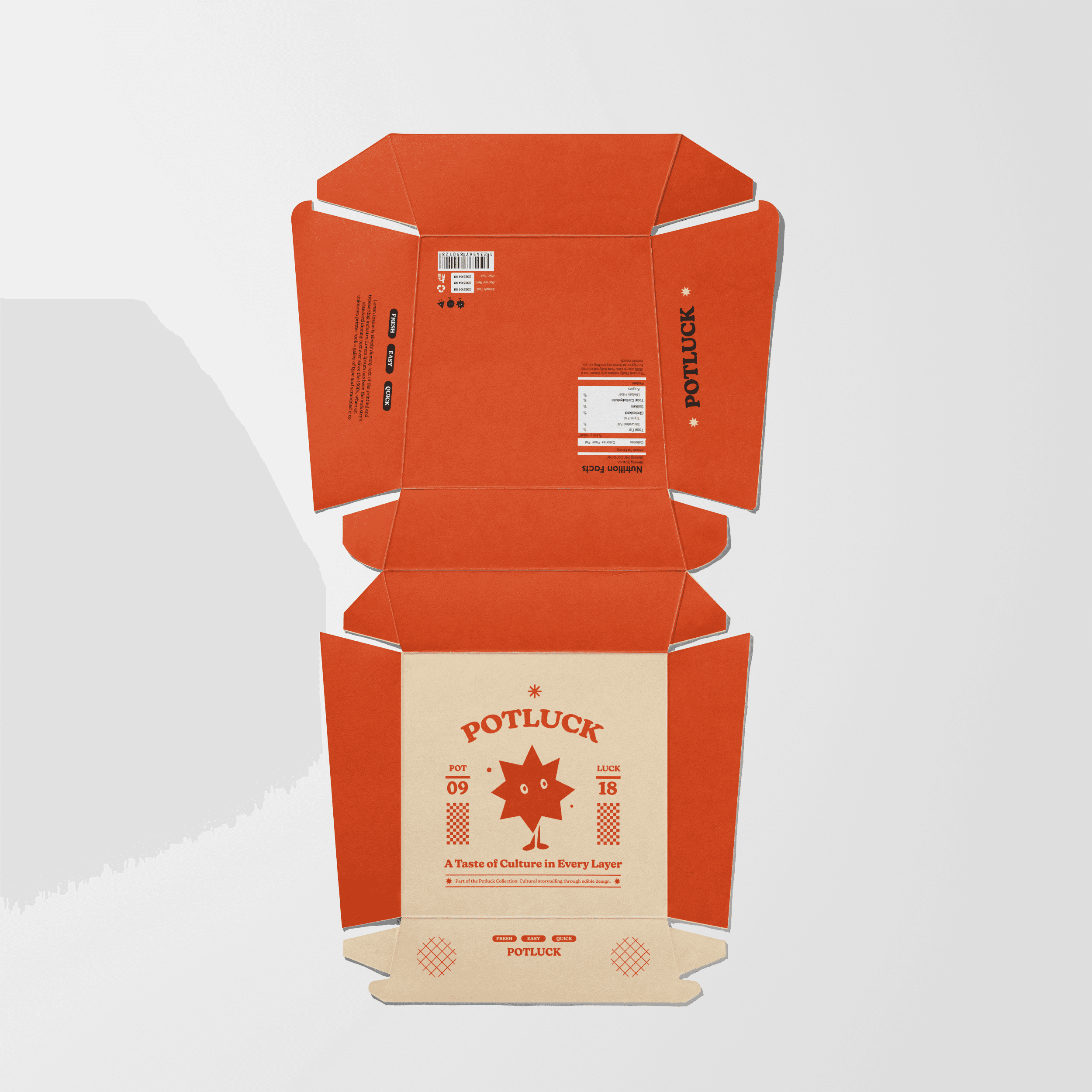
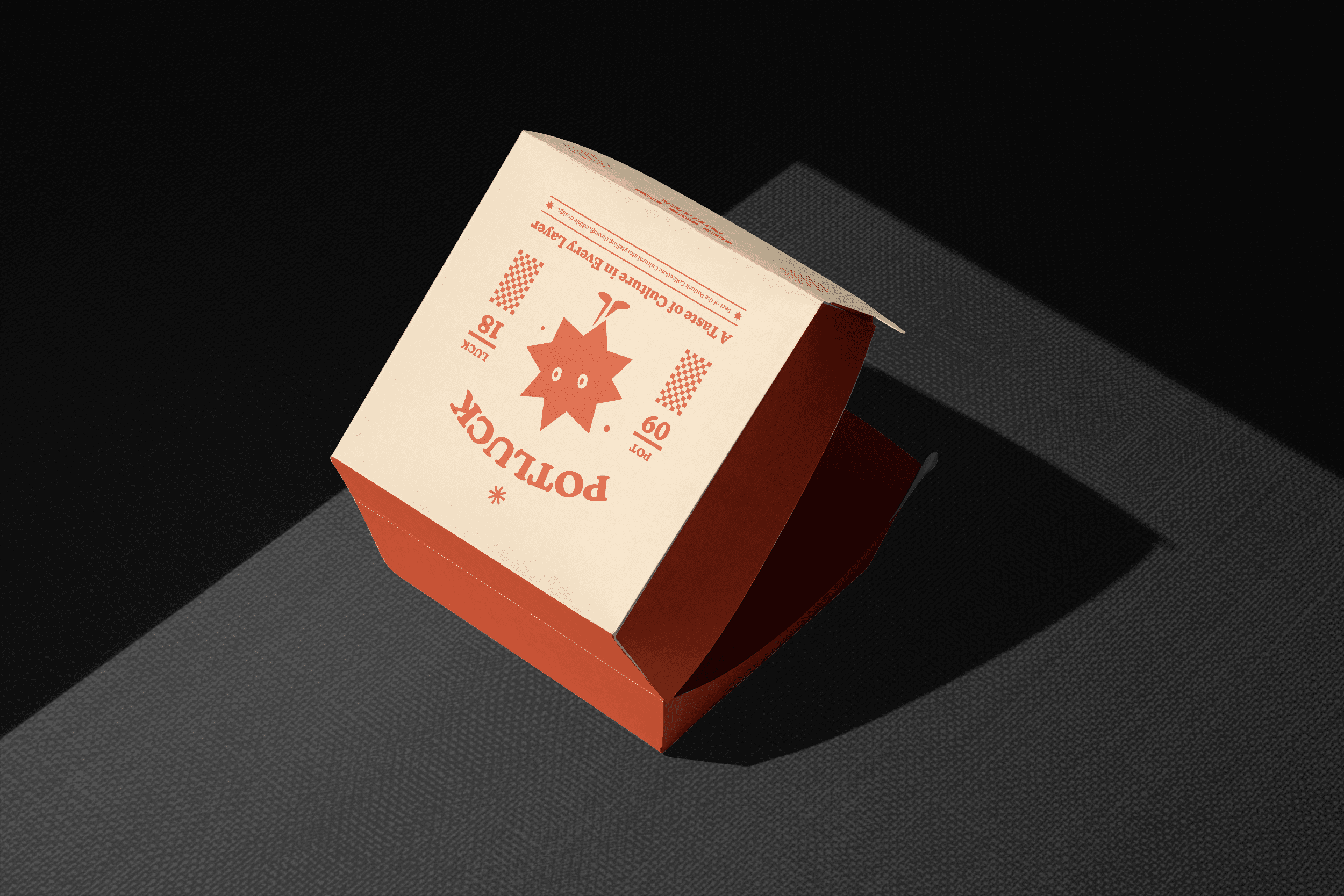
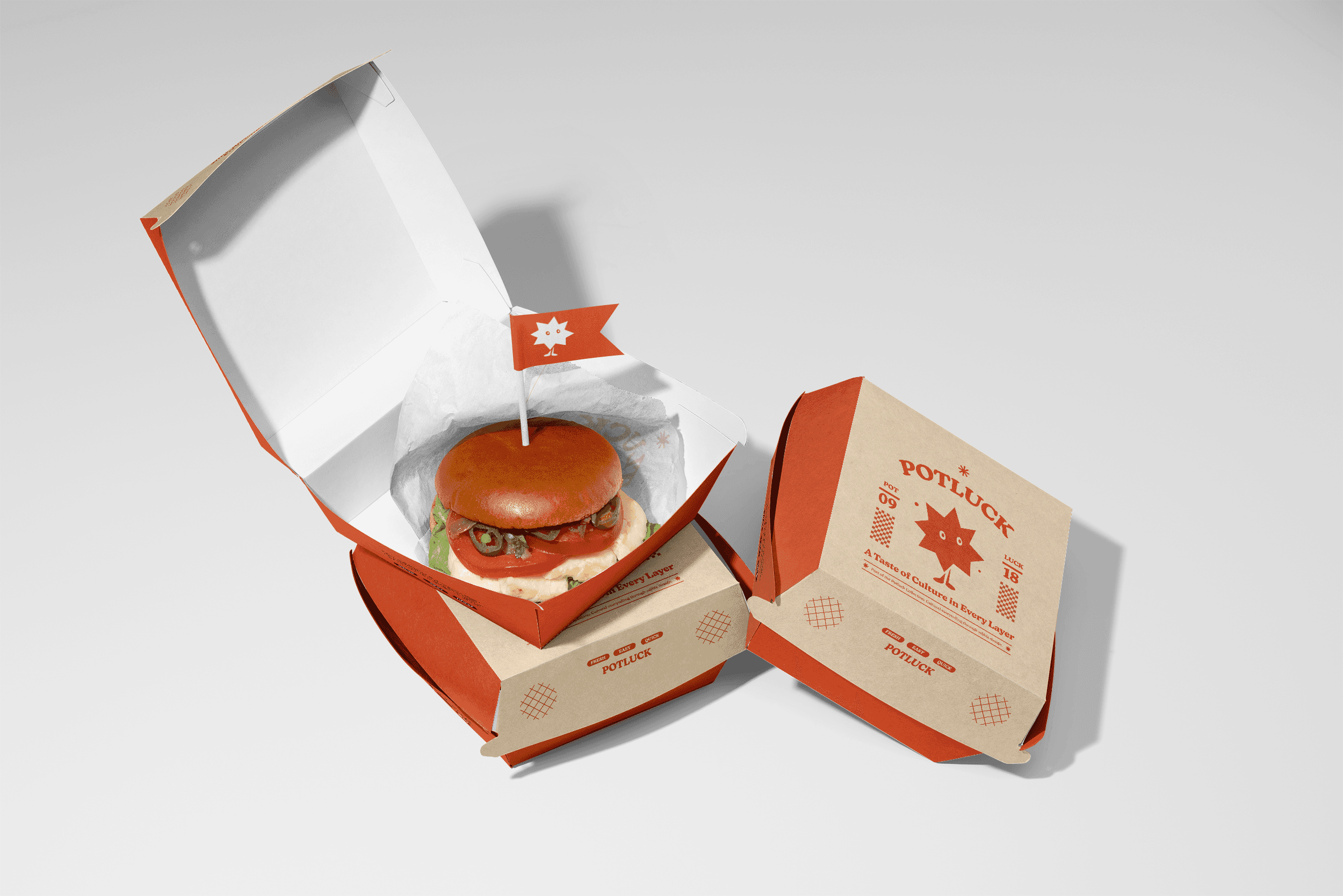
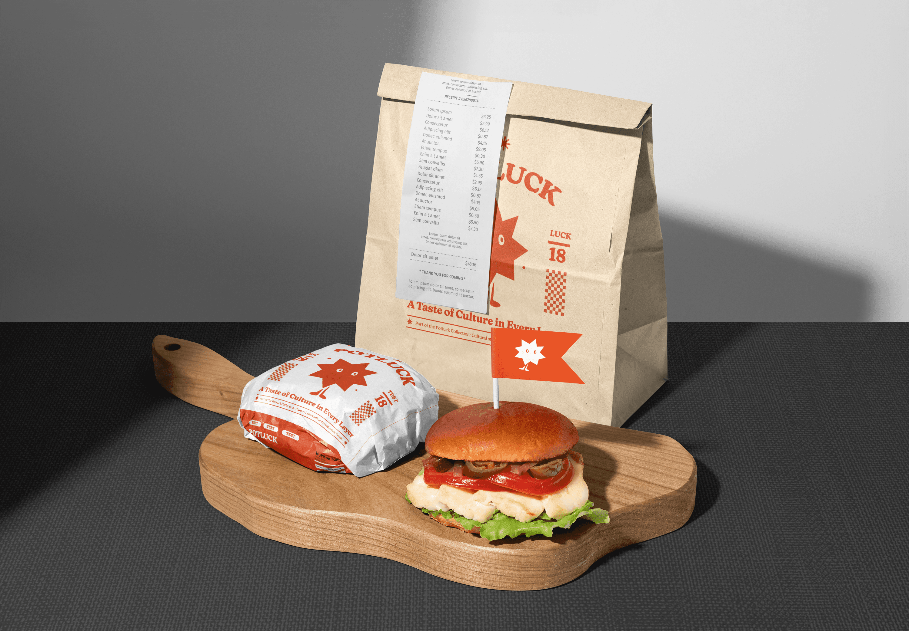
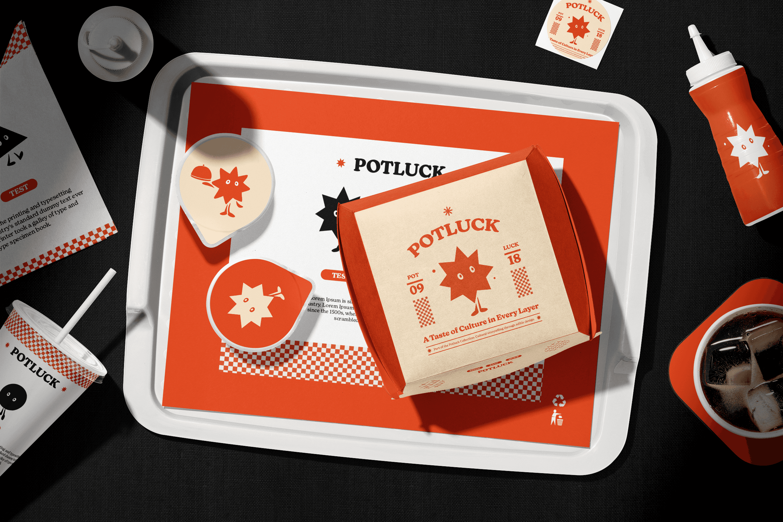
Designed a simple, friendly character mark representing the potluck spirit—modular, expressive, and adaptable across scale, Developed a playful yet structured logo with a retro-inspired typeface and limited icon set, The voice of the brand was warm and communal, always inviting and a bit cheeky Selected a limited duotone palette (spicy red and sesame tan) reminiscent of classic burger shops with a modern twistUsed halftone patterns, oversized type, and grid textures to nod to both convenience store packaging and designer-led food brands
Client POTLUCK Year 2025 Services Branding, Packaging, Character, Motion
Hungry for more?