
Seoul Metro
Client
Art Direction, Brand Identity
Services
2023
This exhibition project was developed as a visual identity proposal for Seoul Metro Station. Drawing inspiration from the architecture’s distinct triangular roof and the building’s layered renovation history, I reimagined a century-old public space into a modular graphic system that merges history with transit iconography. The goal was to create a system that honors both the structural legacy and emotional significance of Seoul Station as a civic space.


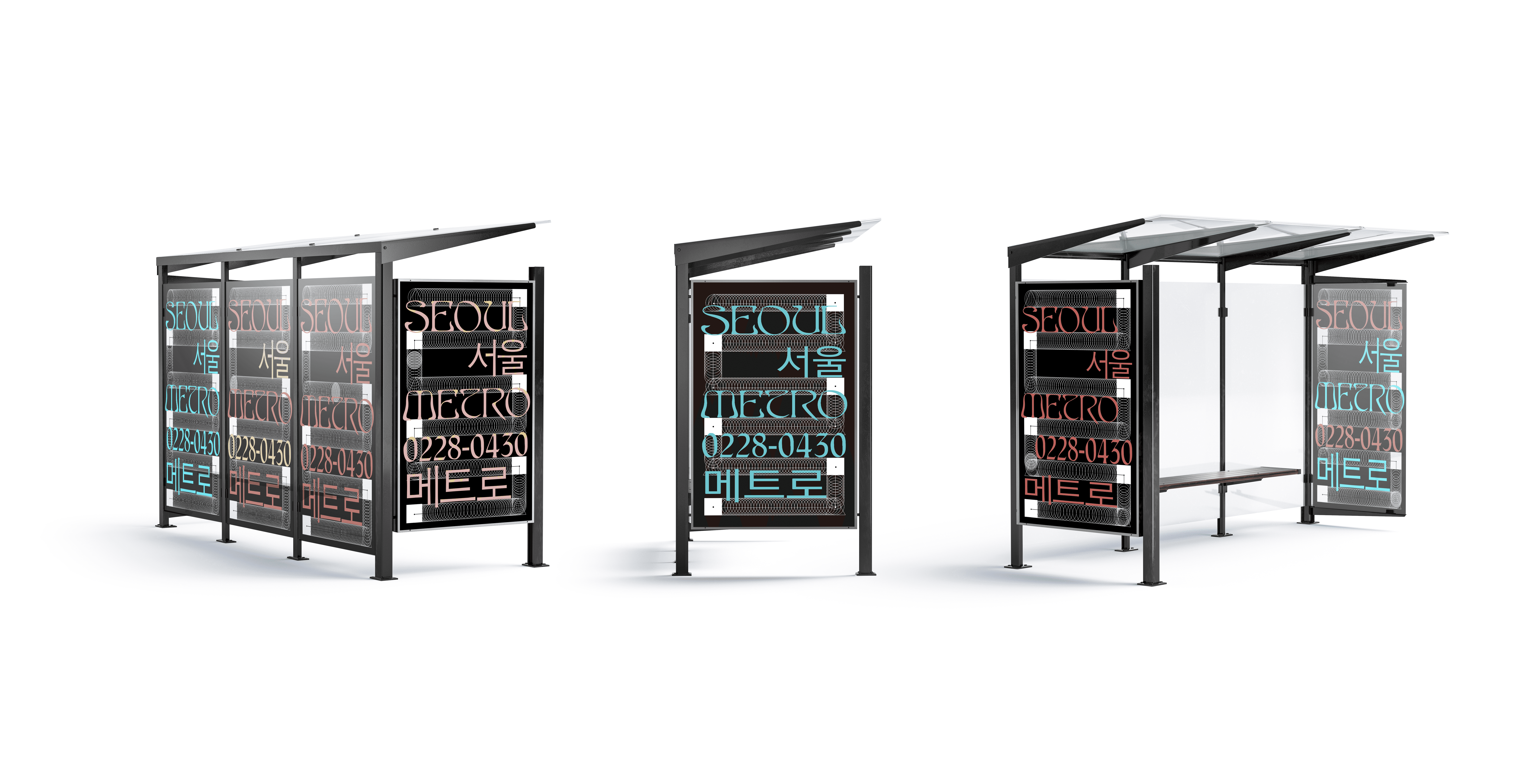
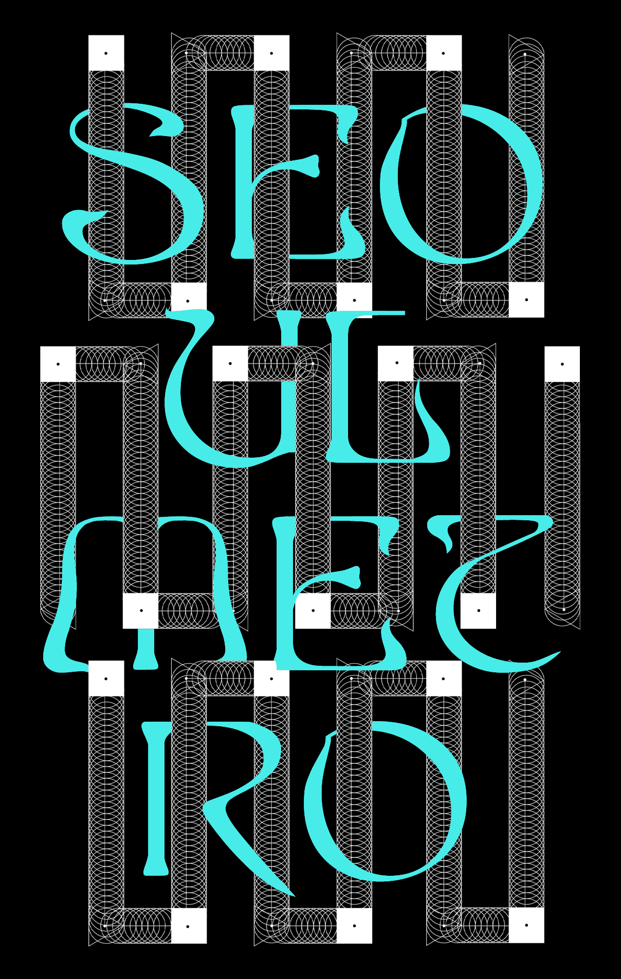
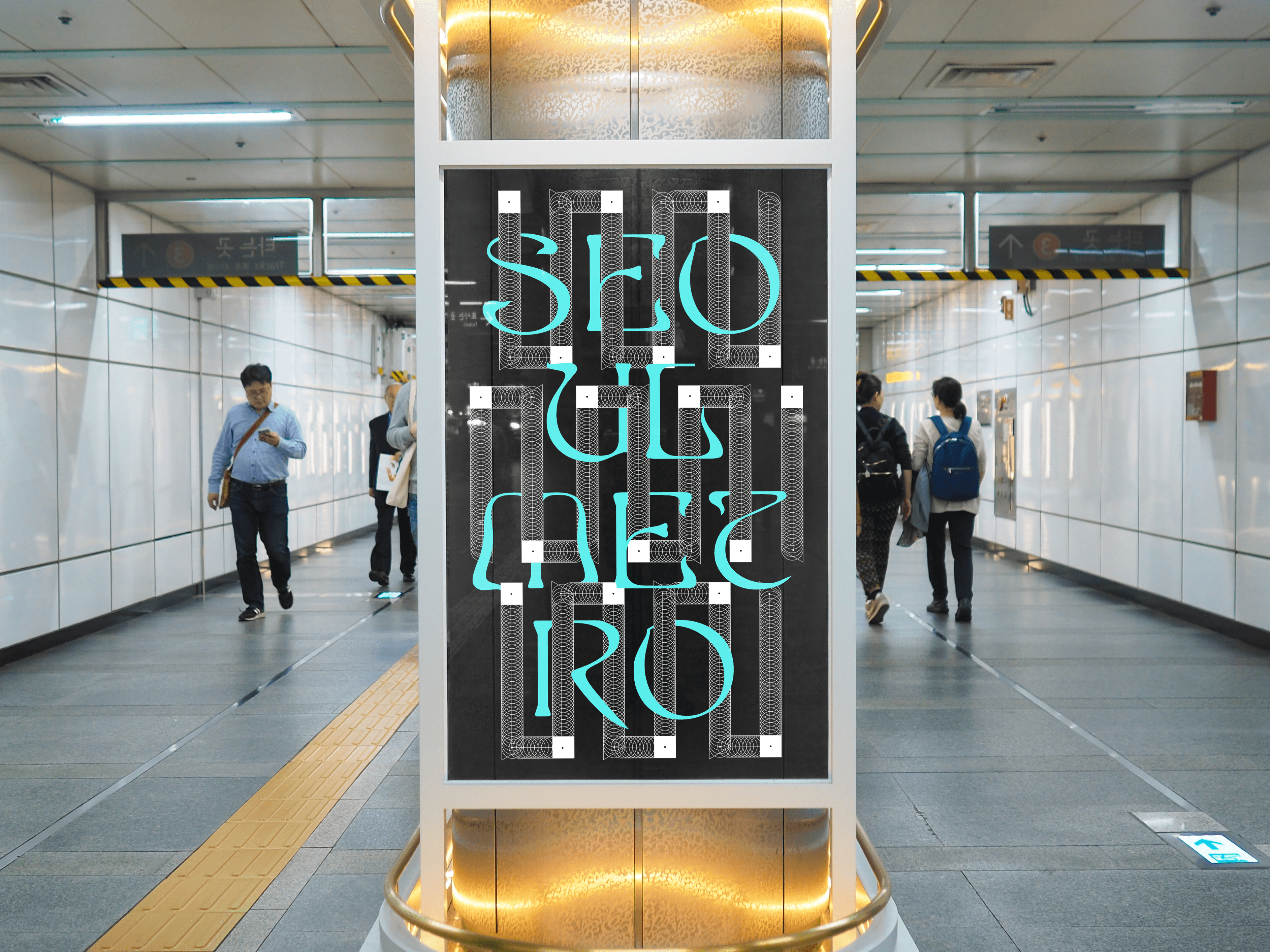
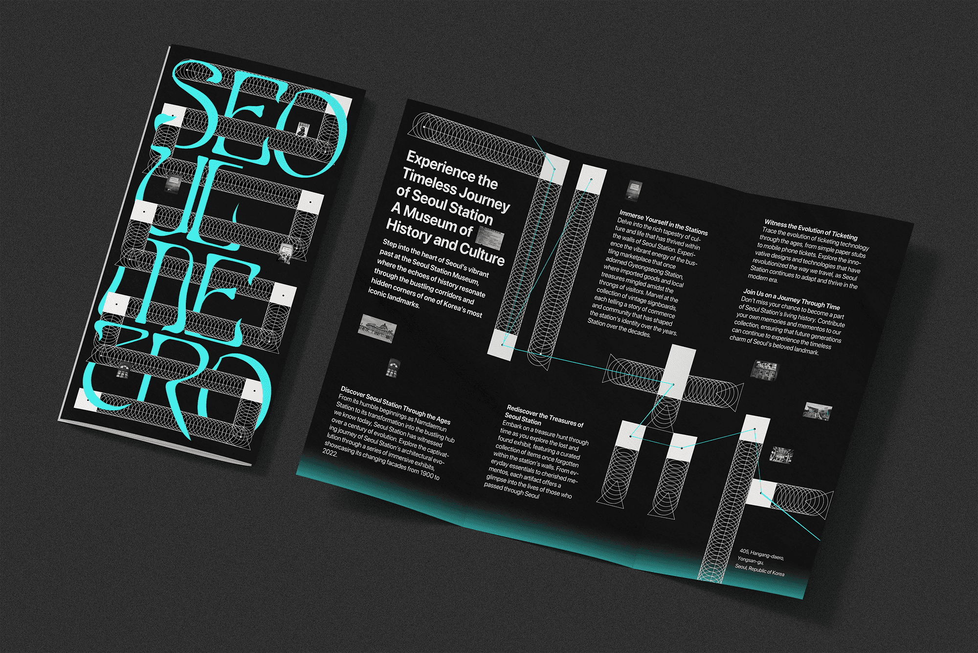
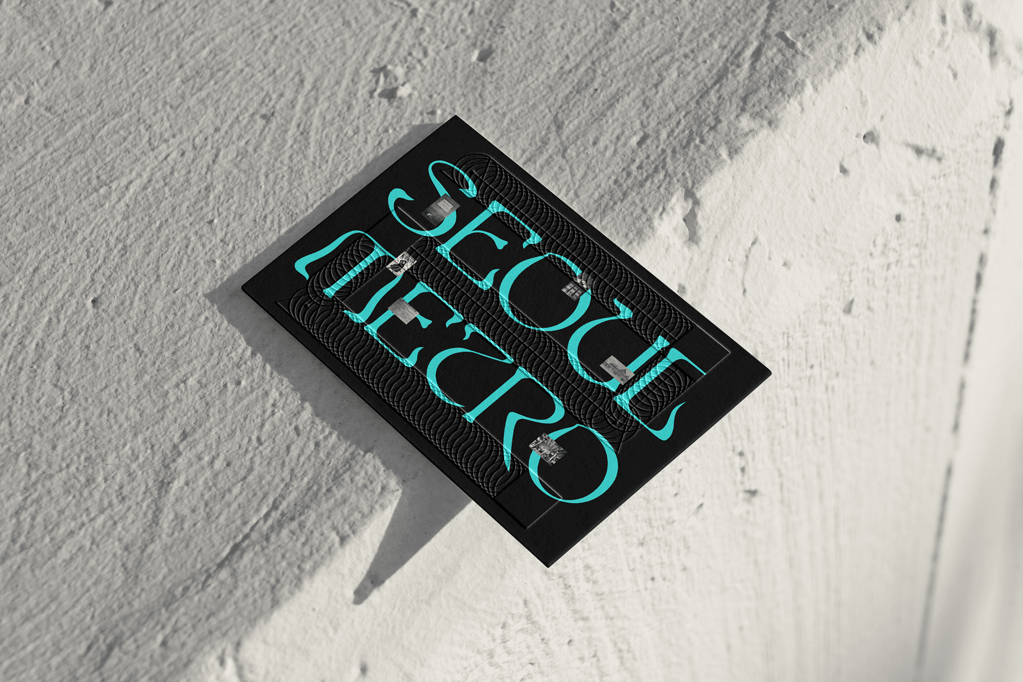
Developed a visual system using three simplified forms—circle, triangle, square—each representing a different architectural phase of the station’s renovation Extracted three core colors—beige, sky blue, and crimson—from historical reference photos, materials, and interior motifs These modules were reconfigured into sequences evocative of subway wheels, train rails, and passenger flow The continuous circles suggest rail motion and connection Typography blends vintage Korean sans-serif styles with contemporary forms, referencing Seoul’s modernization while preserving its narrative tone All visual elements were designed to resonate across age groups and backgrounds, avoiding literal or loaded iconography
Client Seoul Metro Year 2023 Services Art Direction, Brand Identity Typefaces EddaFilled
Hungry for more?